Data visualisation
Frontpage Data visualisation Parametizing data Directory structure R-package SQL Zotero Reproductibility Future endeavours Free research (Machine learning) CV Bibliography
To prove my skills in handling and making initial visualisations of data, a mock dataset supplied by J. louter (INT/ILC) has been analysed. This dataset was derived from an experiment in which adult C.elegans were exposed to varying concentrations of different compounds. Then, after an exposure time of 68 hours, these C.elegans were tested for amount of offspring they gave.
Firstly, the data (which was stored in an Excel file) has been read using tidyverse’s “readxl()”. A datatable has been created to show this initial dataset
excel_location<-here::here("data.raw/CE.LIQ.FLOW.062_Tidydata.xlsx")
Celegans_data_raw<-read_excel(excel_location, sheet = 1)
datatable(Celegans_data_raw, options = list(
  scrollX=TRUE
))
After reading in this data, it has been transformed in order to be able to create proper figures from it. For this, the important data columns have been selected: expType: The type of experiment (Experimental, control)
RawData: Amount of offspring C.elegans gave after 68 hours of exposure to the treatment
compName: The compound to which the C.elegans was exposed to.
compConcentration: The concentration of the compound which the C.elegans was exposed to.
#Dataset inspection and transformation

#Selecting data for this goal
Celegans_data_select<-Celegans_data_raw %>% dplyr::select(expType, compName, RawData, compConcentration)

#Datapoint 259 has a comma instead of a point. Transforming value via str_replace
Celegans_data_select$compConcentration<-Celegans_data_select$compConcentration %>% str_replace(",", ".")

#Now properly transforming the compConcentration data into numeric
Celegans_data_select$compConcentration<-Celegans_data_select$compConcentration %>% as.numeric()

#Transforming expType and compName into a factor variable

levels_exptype<-unique(Celegans_data_select$expType) #storing all exptype levels
Celegans_data_select$expType<-factor(Celegans_data_select$expType, levels = levels_exptype) #Transforming exptype
levels_compname<-unique(Celegans_data_select$compName) #Storing all compName levels
Celegans_data_select$compName<-factor(Celegans_data_select$compName, levels = levels_compname) #Transforming compName->factor

#Filtering NA's from RawData
Celegans_data_select<-Celegans_data_select %>% filter(!is.na(RawData))


#Re-loading the data
Celegans_data<-Celegans_data_select

#Checking if transformation went properly
datatable(Celegans_data, options = list(
  scrollX=TRUE
))
After tidying the data from the excel file, exploratory graphs have been created to study the data more thoroughly
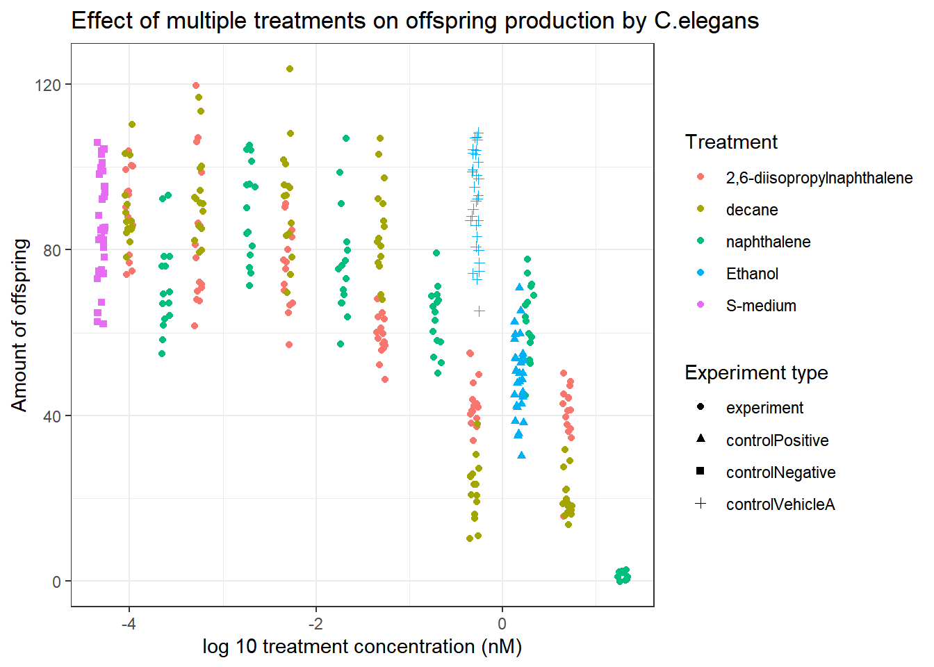
Celegans_data %>% ggplot(aes(x=log10(compConcentration+0.00005), y=RawData))+ #Added 0.0005 to prevent data loss
  geom_jitter(aes(colour=compName, shape=expType), width = 0.05)+
  theme_bw()+
  labs(
    title="Effect of multiple treatments on offspring production by C.elegans",
    x="log 10 treatment concentration (nM)",
    y="Amount of offspring",
    colour="Treatment",
    shape="Experiment type"
  )
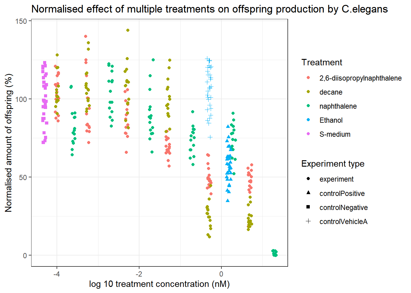
To properly be able to study the effect of the different treatments on C.elegans, the data will be normalized for the negative control S-medium.
#Determine the mean of the negative control
negctrl_mean<-Celegans_data_select$RawData[Celegans_data_select$expType=="controlNegative"] %>% mean()

#Normalising the data
Celegans_data_select_normalised<-Celegans_data_select %>% mutate(
  normalised_RawData_percentage=RawData/negctrl_mean*100
)

#Plotting the normalised data
Celegans_data_select_normalised %>% ggplot(aes(x=log10(compConcentration+0.00005), y=normalised_RawData_percentage))+
  geom_jitter(aes(colour=compName, shape=expType), width = 0.05)+
  theme_bw()+
  labs(
    title="Normalised effect of multiple treatments on offspring production by C.elegans",
    x="log 10 treatment concentration (nM)",
    y="Normalised amount of offspring (%)",
    colour="Treatment",
    shape="Experiment type"
  )
For a clearer picture of the correlations, a summarized version of the graph has also been made:
#Creating a summarised version of the data based on Treatment and concentration
Celegans_data_normalised_sum<-Celegans_data_select_normalised %>%
  dplyr::filter(!is.na(normalised_RawData_percentage)) %>%
  dplyr::group_by(compConcentration, compName) %>%
  dplyr::summarise(
  mean_normalised=mean(normalised_RawData_percentage)
)
## `summarise()` has grouped output by 'compConcentration'. You can override using the `.groups` argument.#Filtering out S-medium, as that is the negative control.
Celegans_data_normalised_sum<-Celegans_data_normalised_sum %>% filter(!compName=="S-medium")
#Plotting the summarised data.
Celegans_data_normalised_sum %>% ggplot(aes(x=log10(compConcentration+0.00005), y=mean_normalised))+
geom_point(aes(colour=compName), size=3)+
geom_line(aes(colour=compName))+
theme_bw()+
labs(
title="Normalised effect of multiple treatments on offspring production by C.elegans",
x="log 10 treatment concentration (nM)",
y="Normalised amount of offspring (%)",
colour="Treatment"
)![]()
Based on these exploratory graphs, we can conclude that 2,6-diisopropylnaphthalene, decane and nephthalene all cause a decrease in the ammount of offspring generated by C.elegans. Decane only appears to decrease offspring at higher concentrations, 2,6-diisopropylnaphthalene seems to cause a relatively constant decrease in offspring at increasing concentrations, and nephthalene seems to stagnate untill extremely high concentrations are used.
Based on this data, a LC-50 analysis could be performed.