Parametized Data Germany
Frontpage Data visualisation Parametizing data Directory structure R-package SQL Zotero Reproductibility Future endeavours Free research (Machine learning) CV Bibliography
To prove my skills in the producing parametized .Rmd’s, I’ve used an online COVID-19 dataset and parametized the visualisation of this data file. For this parameterization, the country of the data, the year of the data and the months which the data covers have been added as variables.
For this page, the parameter have been set too:
Country: Germany (Only shows data from the Germany)
Year: 2020, 2021, 2022 (Shows data from 2020, 2021, 2022)
Month: 1, 2, 3, 4, 5, 6, 7, 8, 9, 10, 11, 12 (Shows data from months number 1, 2, 3, 4, 5, 6, 7, 8, 9, 10, 11, 12)
In order to showcase this, this process has been repeated for 3 sets of parameters
# Parameters have been manually set for the purpose of this site, as bookdown does not support stating parameters in YAML
parameter$country<-"Germany"
parameter$year<-c(2020:2022)
parameter$month<-c(1:12)
############################################################### Reading data
covid_data<-read.csv("./data.raw/data.csv")
covid_data_vis<-covid_data
############################################################### Mangling data
covid_years<-covid_data$year %>% unique()
covid_data_vis$year<-factor(as.character(covid_data$year), levels = as.character(covid_years)) #Making year a factor so it
#colours nicely instead of using a gradiant
months<-c("January", "Februari", "March", "April", "May", "June", "July", "August", "September", "October", "November",
"December") #Storing months to put on the x-axis
covid_data_vis_filter1<-covid_data_vis %>% filter(year %in% parameter$year,
month %in% parameter$month,
countriesAndTerritories %in% parameter$country)
############################################################### Creating visualisation: Cases per month
covid_data_vis_filter1 %>% group_by(month, year) %>% dplyr::summarise(
cases=mean(cases, na.rm=TRUE)
) %>% ggplot(aes(x=month, y=cases))+
geom_point(aes(color=year))+
geom_line(aes(group=year, color=year))+
theme_bw()+
theme(axis.text.x = element_text(angle=45, hjust=1))+
labs(
title=paste0("SARS-COV 2 cases in ",parameter$country, " per month"),
subtitle = "Data from ECDC",
x="Month",
y="COVID-19 cases",
color="Year"
)+
scale_x_continuous(breaks=(seq(1:12)), labels = months)## `summarise()` has grouped output by 'month'. You can override using the `.groups` argument.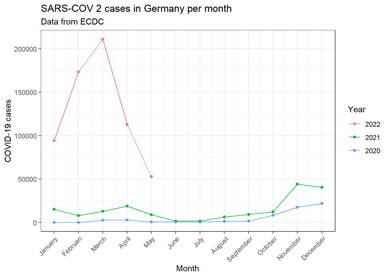
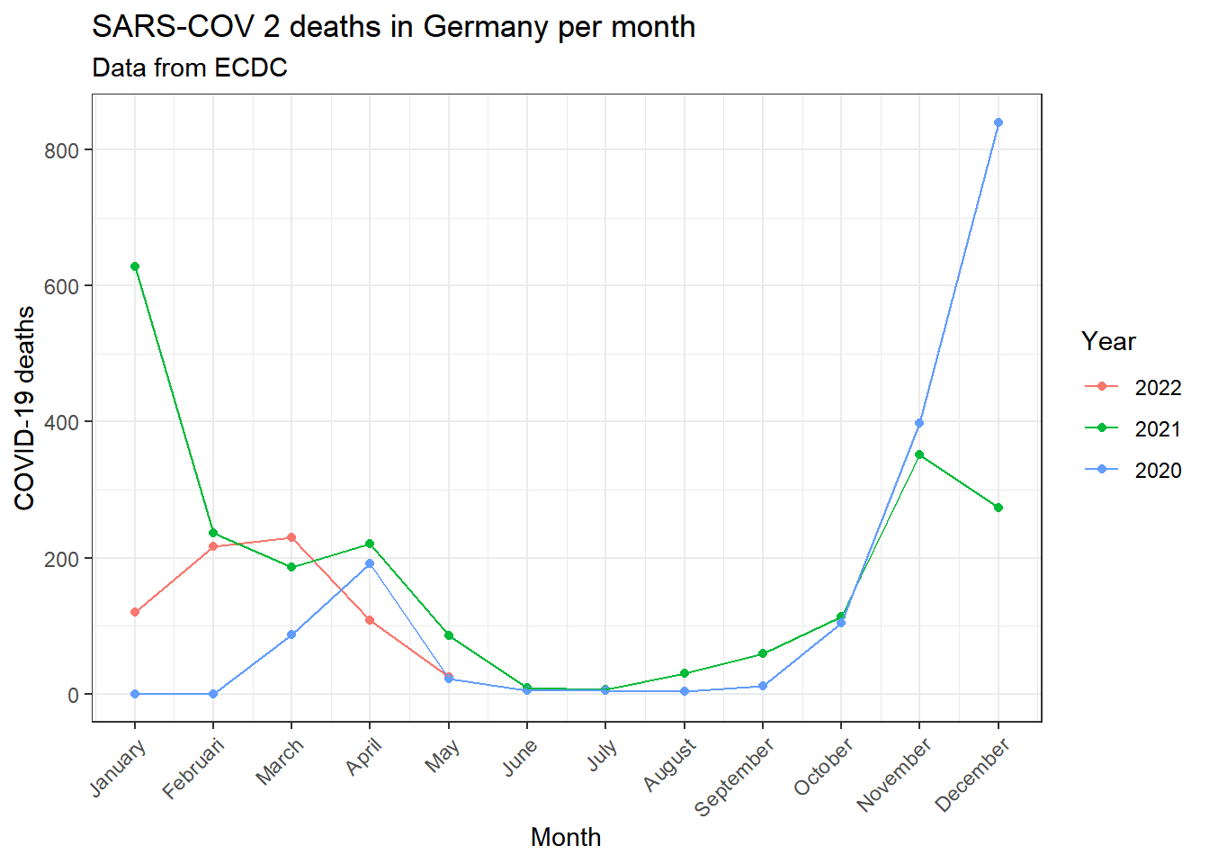
############################################################# Creating visualisation: Deaths per month
covid_data_vis_filter1 %>% group_by(month, year) %>% dplyr::summarise(
  deaths=mean(deaths, na.rm=TRUE)
) %>% ggplot(aes(x=month, y=deaths))+
  geom_point(aes(color=year))+
  geom_line(aes(group=year, color=year))+
  theme_bw()+
  theme(axis.text.x = element_text(angle=45, hjust=1))+
  labs(
    title=paste0("SARS-COV 2 deaths in ",parameter$country, " per month"),
    subtitle = "Data from ECDC",
    x="Month",
    y="COVID-19 deaths",
    color="Year"
  )+
  scale_x_continuous(breaks=(seq(1:12)), labels = months)
## `summarise()` has grouped output by 'month'. You can override using the `.groups` argument.